C.R. Laurence
CRL is the industry’s leading provider of architectural metals and glazing supplies, needed a brand refresh to reinforce its image as a high-quality, innovative provider. In a competitive market, the goal was to modernize the brand to resonate with both industry professionals and homeowners, emphasizing durability, precision, and sleek design.
As brand designer and creative lead, I directed the brand strategy and guided a team of designers in developing a cohesive identity across digital and print. I oversaw the design of the new website, business collateral, and packaging, while ensuring alignment with CRL’s values and market positioning. I also coordinated with cross-functional teams to deliver branded swag, posters, and marketing materials that presented a consistent, impactful presence.
The result was a unified brand system that elevated CRL’s image, strengthened customer trust, and positioned the company for long-term growth.
Brand Refresh · Creative Direction · Digital Transformation · Design Systems
Reimagined Logo
The CRL logo is a symbol of the brand and an important corporate asset. It must be protected from misuse by ensuring consistent, high-quality reproduction wherever it appears. Every part of the CRL logo has been carefully designed – from the choice of typeface to the color, size, and spacing. The CRL logo and registration mark (®) exist in a fixed relationship and should only appear in this lockup. The ® symbol protects and maintains our brand. Do not alter the size or placement of the registration mark or leave the ® off. Only the approved digital files should be used to reproduce the logo. The basic rules on the following pages will guide the use of our logo in the best, most consistent way and uphold the quality of CRL communications.
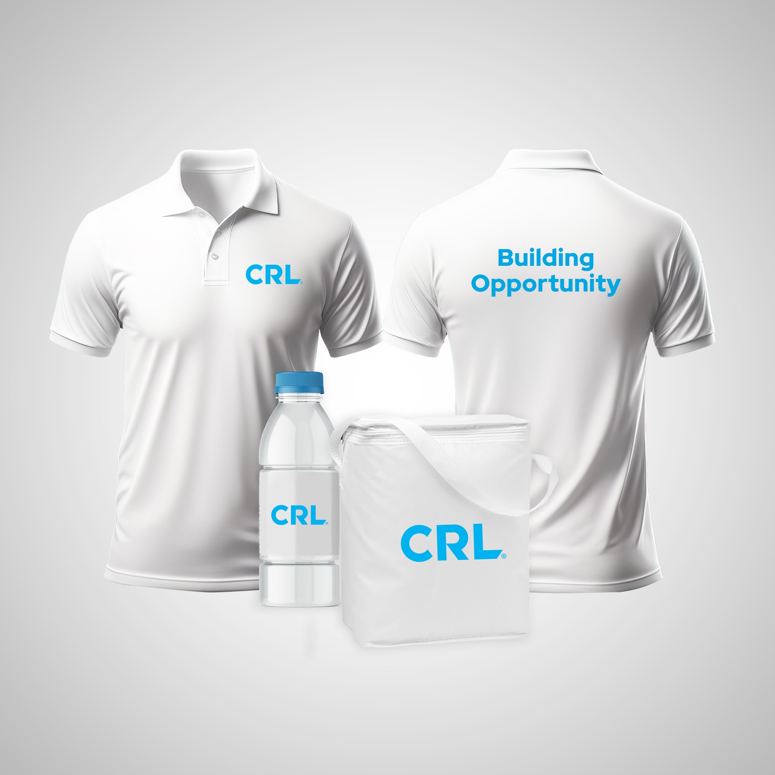

Brand Refresh
I spearheaded a comprehensive rebranding initiative for C.R. Laurence, redefining the company’s entire visual identity. This involved designing a new logo that captures the brand’s legacy while embracing a modern aesthetic, selecting a refined typeface system, and developing a versatile color palette that brings clarity and consistency across all touchpoints. I also introduced custom brand patterns to strengthen visual recognition and cohesion throughout various applications, from print to digital. The goal was to create a timeless, professional identity that reflects the company’s innovation and leadership in its industry. The slideshow below provides a glimpse into the refreshed visual brand identity and how it is applied across different platforms.


Advertising
The following examples demonstrate how the C.R. Laurence visual identity system can be applied across a wide range of print and digital advertising. I led the creative direction and guided my team in applying the updated brand elements—logo, typography, color palette, and graphic patterns—across every piece. By overseeing the process and ensuring alignment, I fostered consistency, clarity, and impact throughout the entire system.

Website
I worked on redesigning the company website with a focus on simplicity and user-friendliness. Using Figma, I created streamlined layouts and intuitive navigation to help customers easily find the products and information they need. The goal was to deliver a clean, modern experience that reflects the updated brand identity while making the site more accessible and efficient for users.